Loading... Please wait...

Categories
Categories
Current Top Sellers
-
$1.89

-
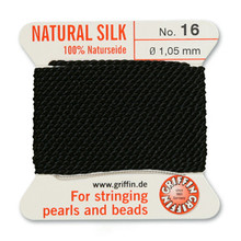 Griffin Silk Beading Cord, Black, #16, apprx 1.05mm (.042"), carded with needle (2 meters), (1 card)$2.86
-
$0.70
-
$6.26

-
$4.29
 New Products
-
$6.11
-
$0.88
-
$0.88
-
$1.60
-
$1.60
-
$1.20
-
$1.20
-
$3.84